
Have you ever wondered why so many fast-food chains use red and yellow? Or why tech companies and banks often favor blue? It is not a coincidence; it is color psychology. Colors evoke specific emotional responses and subconscious associations that directly influence buying behavior. At Versatile Custom Boxes, we know that choosing the right colors for your packaging is a critical strategic decision, and manufacturing those colors accurately is just as important.
Decoding the Color Spectrum
Here is a quick guide to what common packaging colors communicate to your customer:
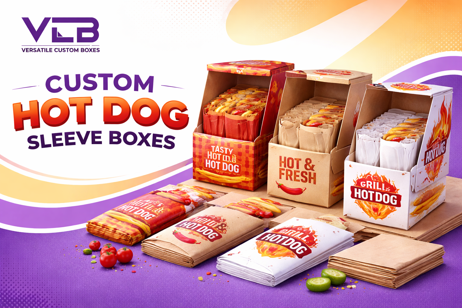
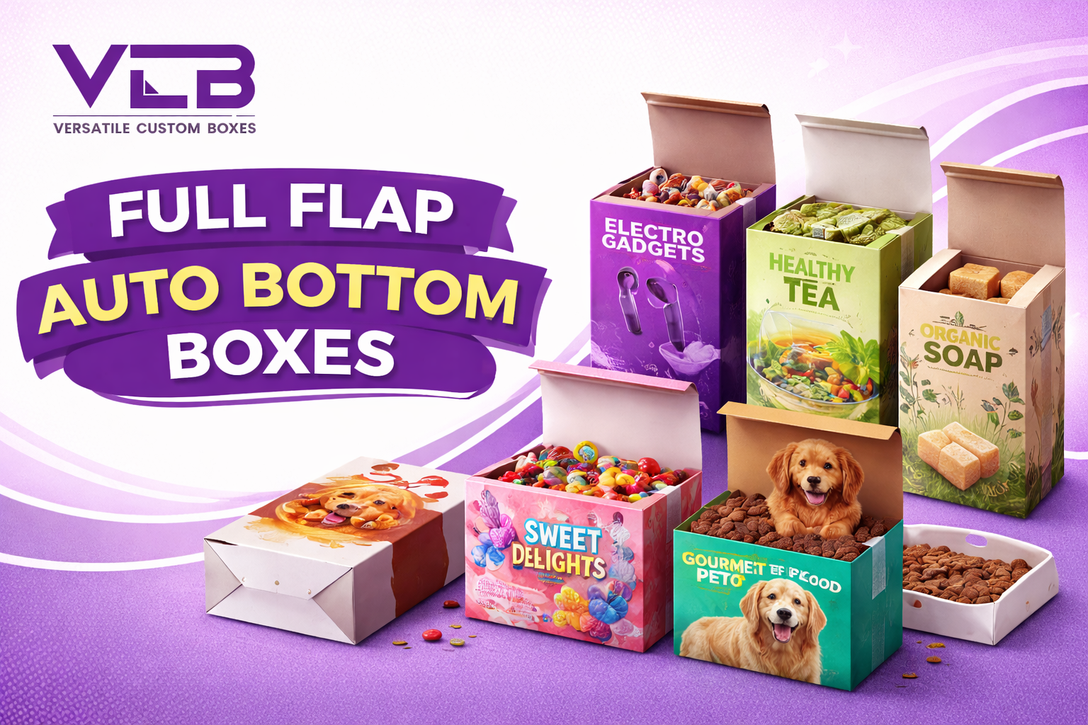
- Red: Associated with excitement, passion, urgency, and appetite. It grabs attention quickly on a shelf. *Best for: Food, impulse buys, and clearance items.*
- Blue: Represents trust, reliability, security, and calmness. It is the favorite color of corporate and tech America. *Best for: Electronics, pharmaceuticals, and professional services.*
- Green: Signifies nature, health, sustainability, and wealth. *Best for: Organic products, eco-friendly brands, and financial products.*
- Black: The color of luxury, sophistication, elegance, and authority. *Best for: High-end cosmetics, premium liquor, and luxury goods.*
- White: Communicates purity, cleanliness, simplicity, and minimalism. *Best for: Skincare, medical products, and modern tech.*
The Importance of Color Consistency in Manufacturing
Understanding the psychology is step one; executing it is step two. There is a big difference between the color you see on your computer screen (RGB) and the color that gets printed on a box (CMYK or Pantone). If your “trustworthy blue” prints as a purple-hued navy, it changes the brand perception.
- CMYK vs. Pantone (PMS): For general printing, we use CMYK (Cyan, Magenta, Yellow, Black). However, for specific brand colors where consistency is non-negotiable (like Coca-Cola red), we use Pantone Matching System (PMS) inks. These are pre-mixed inks that guarantee the exact shade every single time, regardless of the batch size.
- Substrate Impact: The material you print on affects the color. Ink looks different on brown Kraft paper than it does on white coated board. Our printing experts adjust ink density to ensure your chosen colors pop exactly as intended, regardless of the material.
Ensure your brand colors are printed to perfection.
Contact our team at sales@versatilecustomboxes.com or visit here to discuss your color requirements.